Sherman Oaks Rebrand Objective
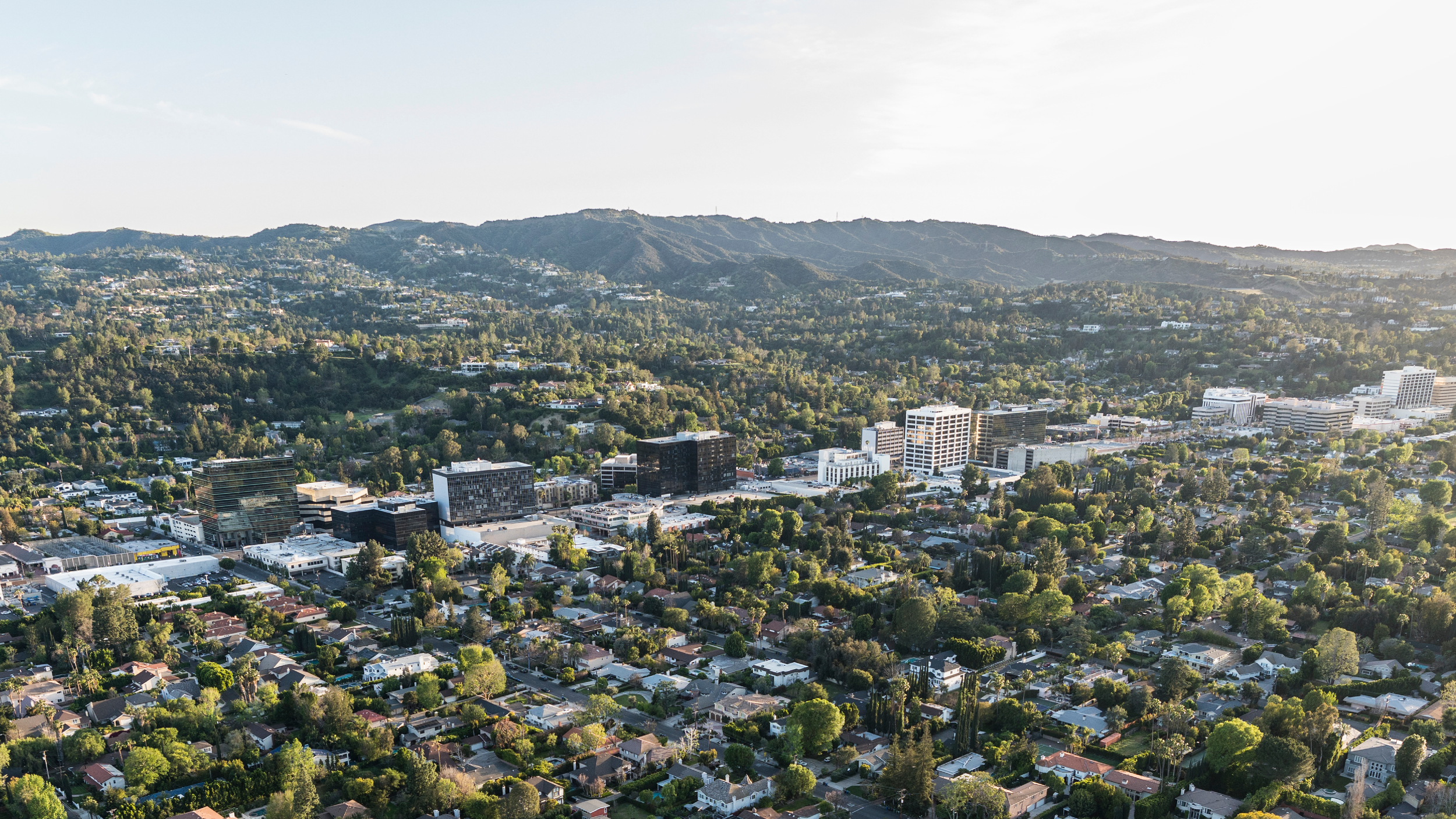
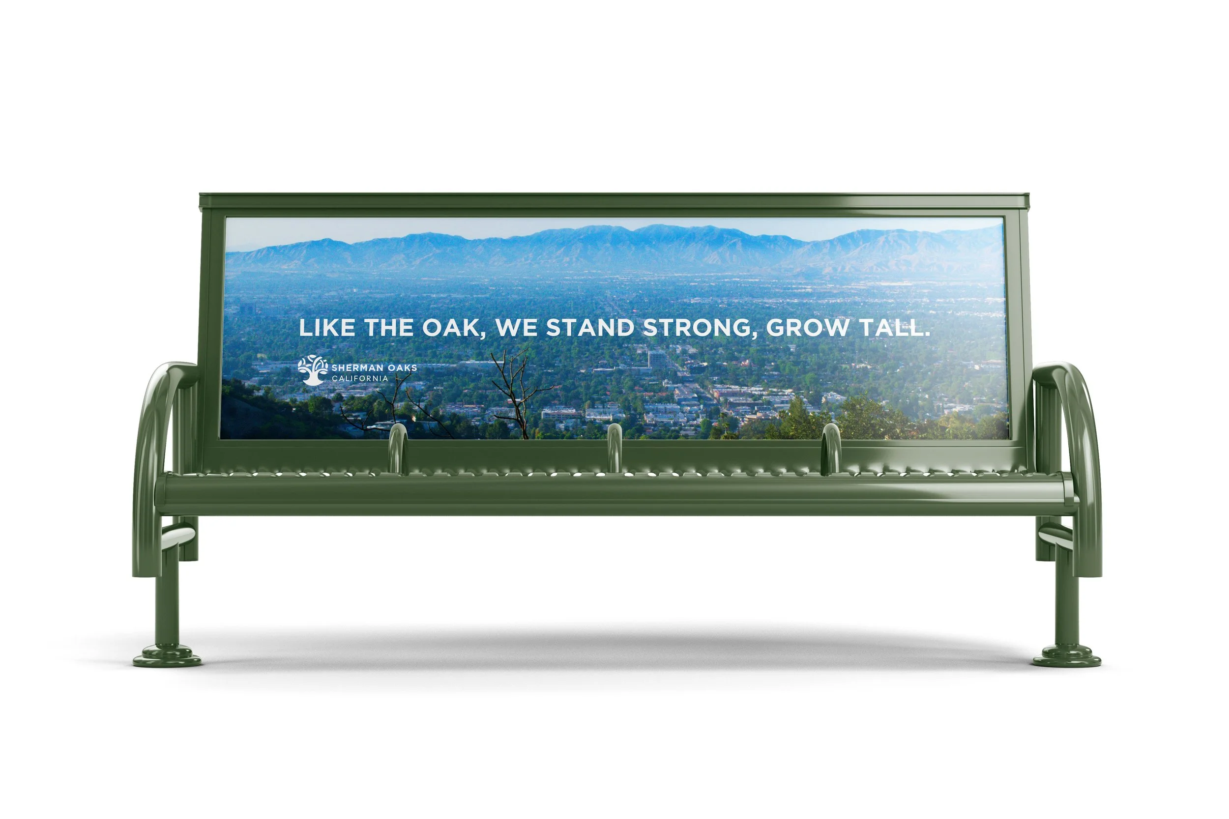
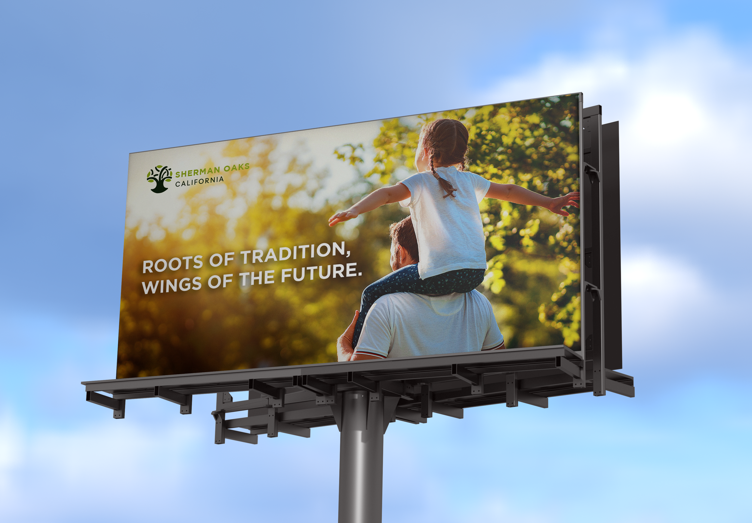
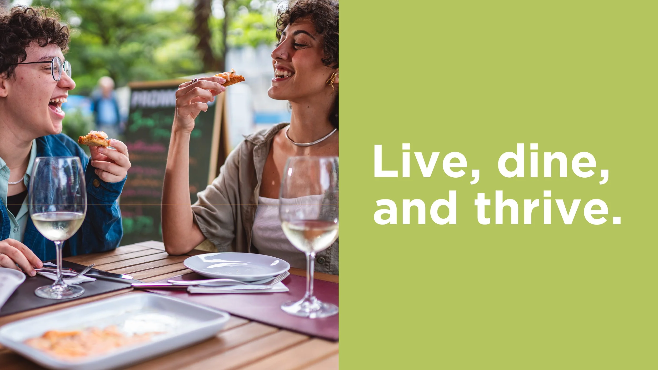
Sherman Oaks is a thriving community where urban energy meets suburban charm. This project explores how the neighborhood’s tree-lined streets, vibrant local businesses, and modern commercial spaces come together to form a distinct and evolving identity. Rooted in a rich history and a strong connection to its natural surroundings, the visual direction reflects balance—blending tradition with contemporary living. As Sherman Oaks continues to grow, the project emphasizes a sense of belonging, community, and forward momentum that defines its dynamic future.
Project Scope
Process
Inspiration
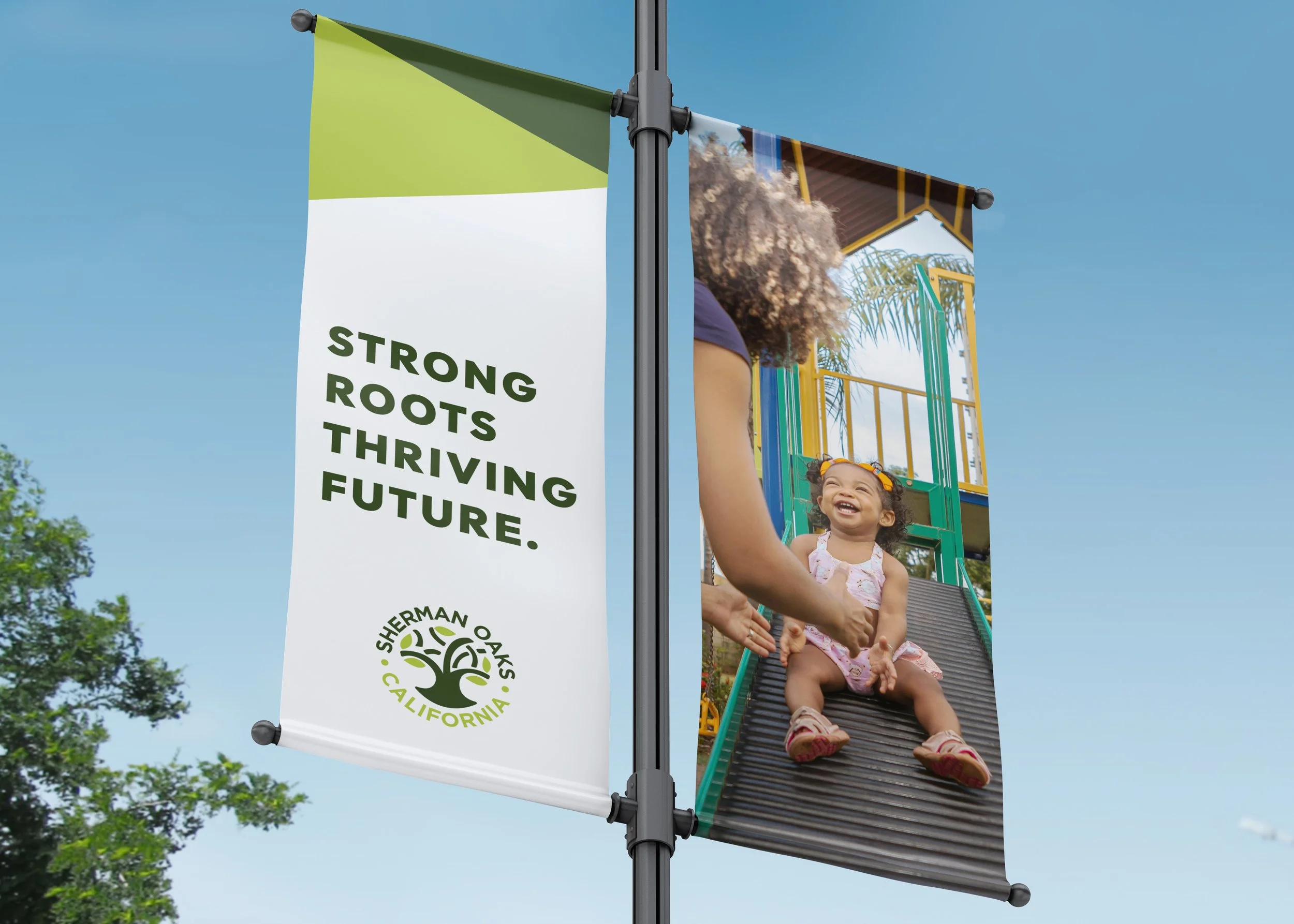
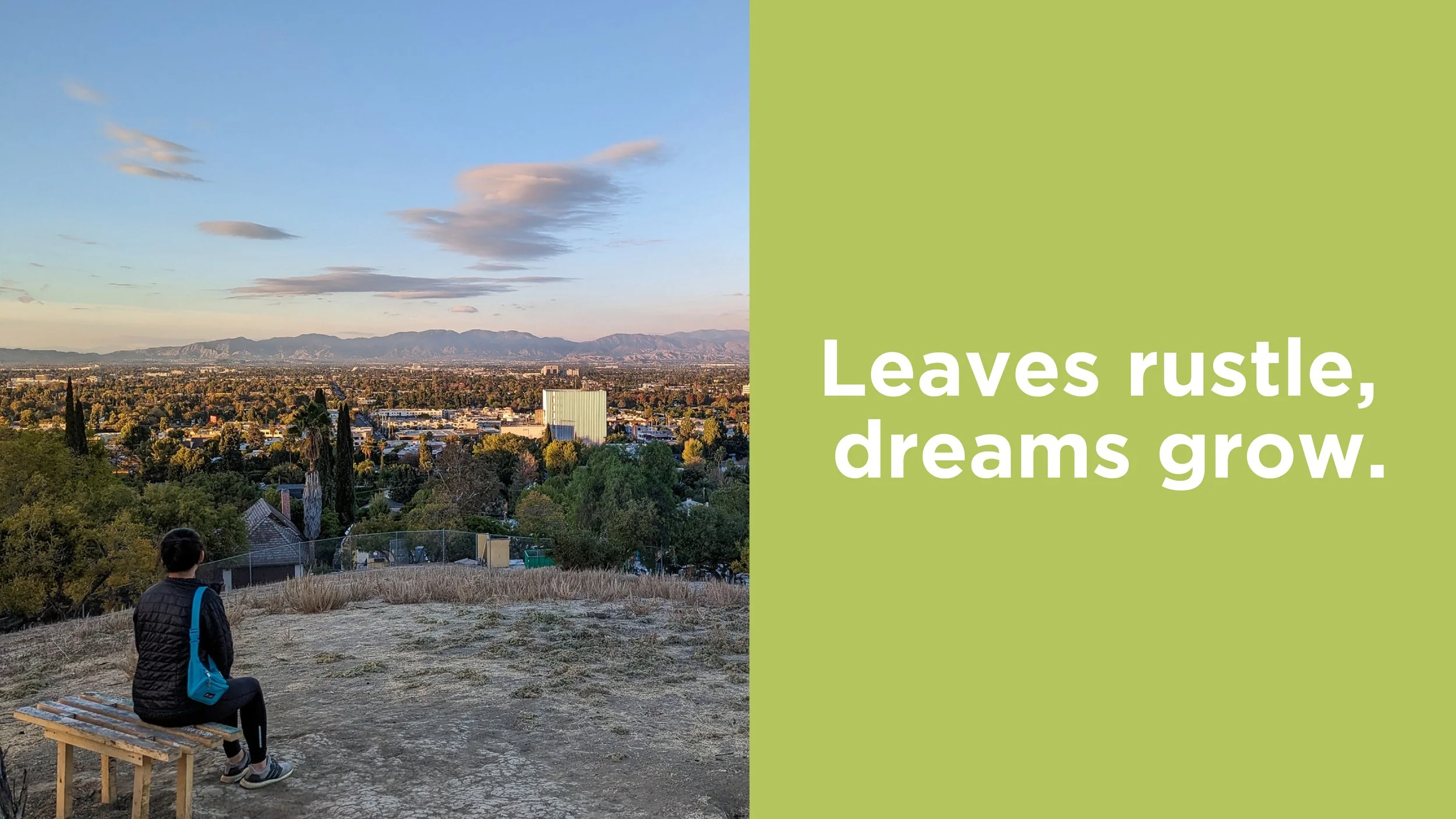
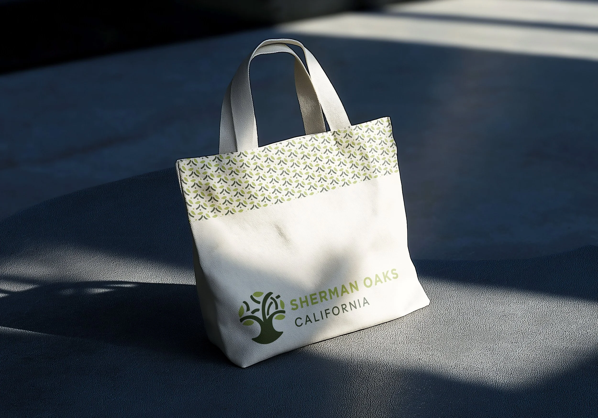
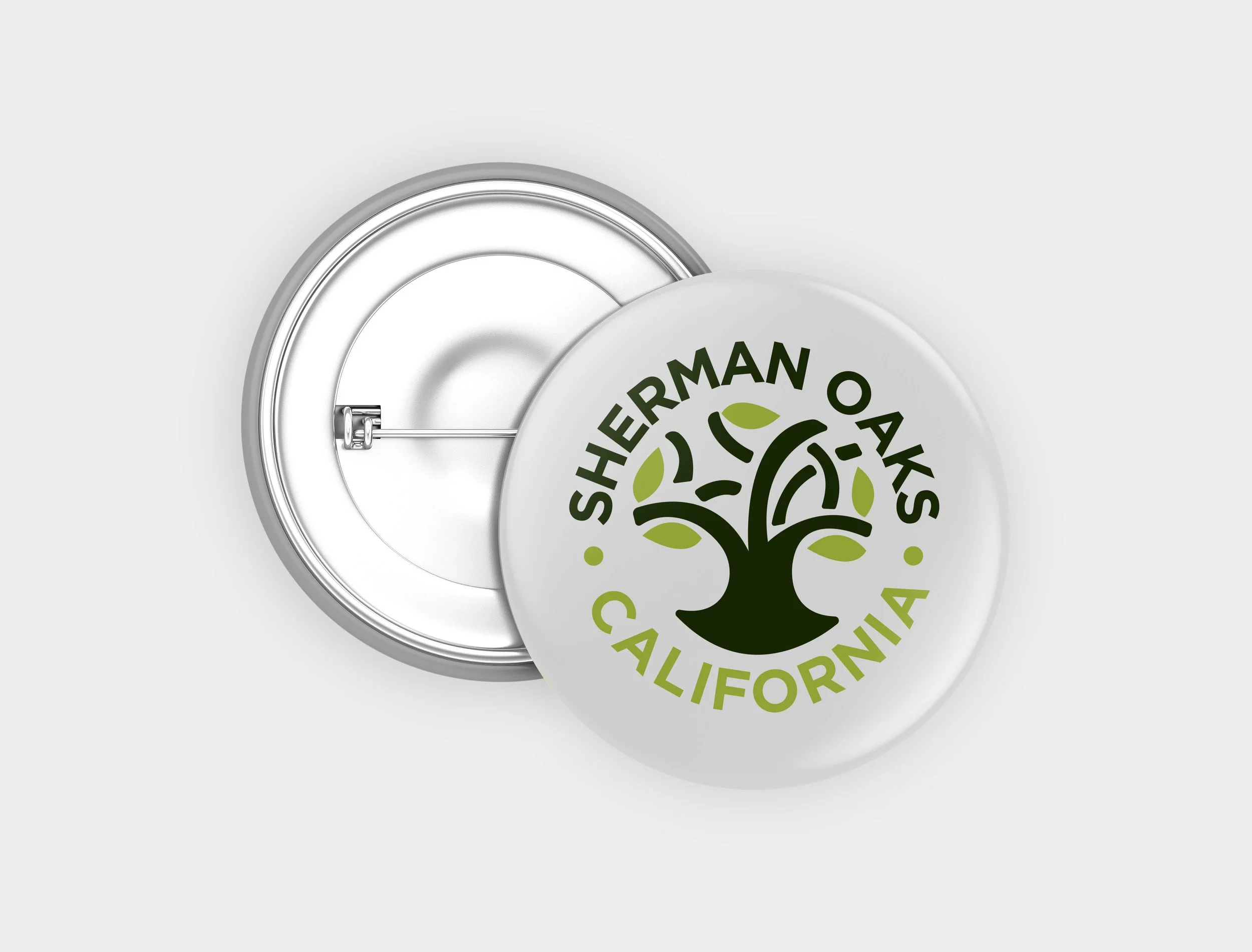
Application
Conclusion

Process
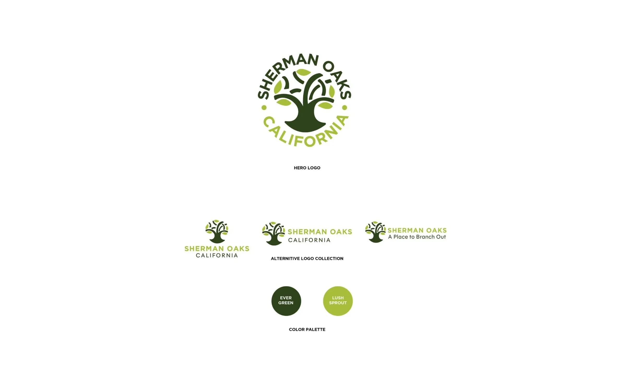
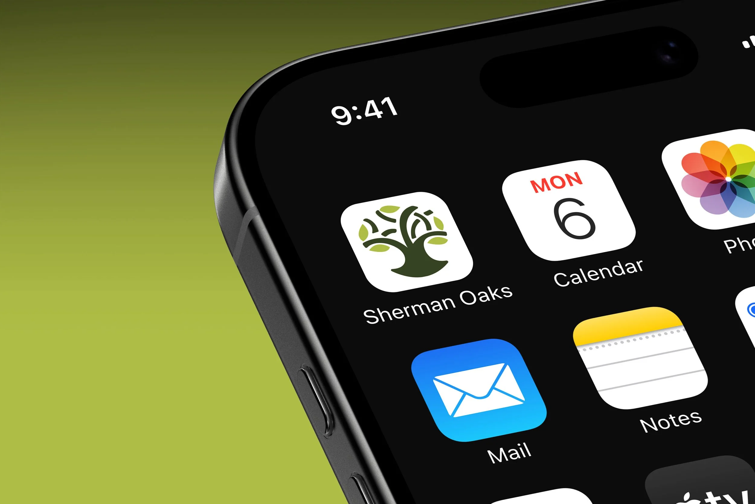
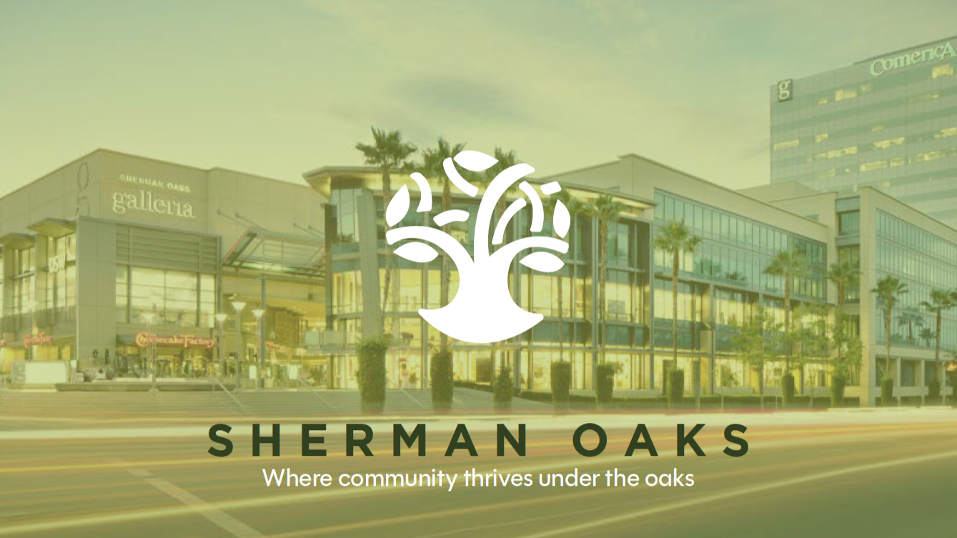
The redesign of Sherman Oaks' logo aimed to create a sleek, modern design that honors the neighborhood’s natural beauty while embracing its urban energy. The design process focused on highlighting the area’s tree-lined streets, symbolizing the harmonious balance between nature and city life. The logo reflects Sherman Oaks' evolving identity, blending its charming heritage with a fresh, dynamic aesthetic.
Inspiration
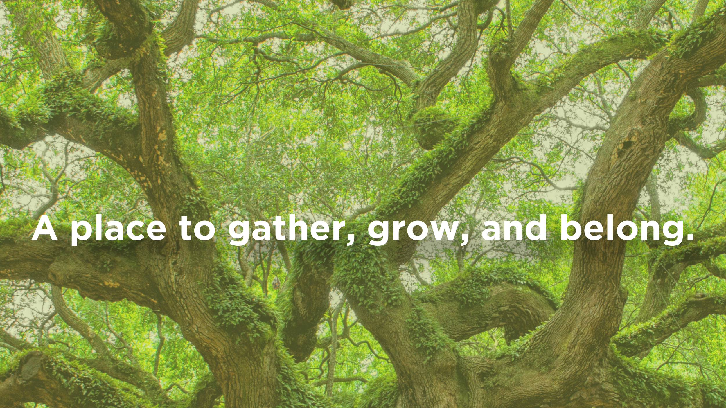
The inspiration for the Sherman Oaks redesign comes from the strength and timeless presence of the oak tree. Its deep roots and expansive branches symbolize growth, stability, and community, qualities that reflect the character of the neighborhood. The design aims to capture the essence of the oak tree, creating a symbol that feels both enduring and welcoming.